Clinical Operations Platform (Confidential)

Shipped

2018-2019UI/UX DESIGNER

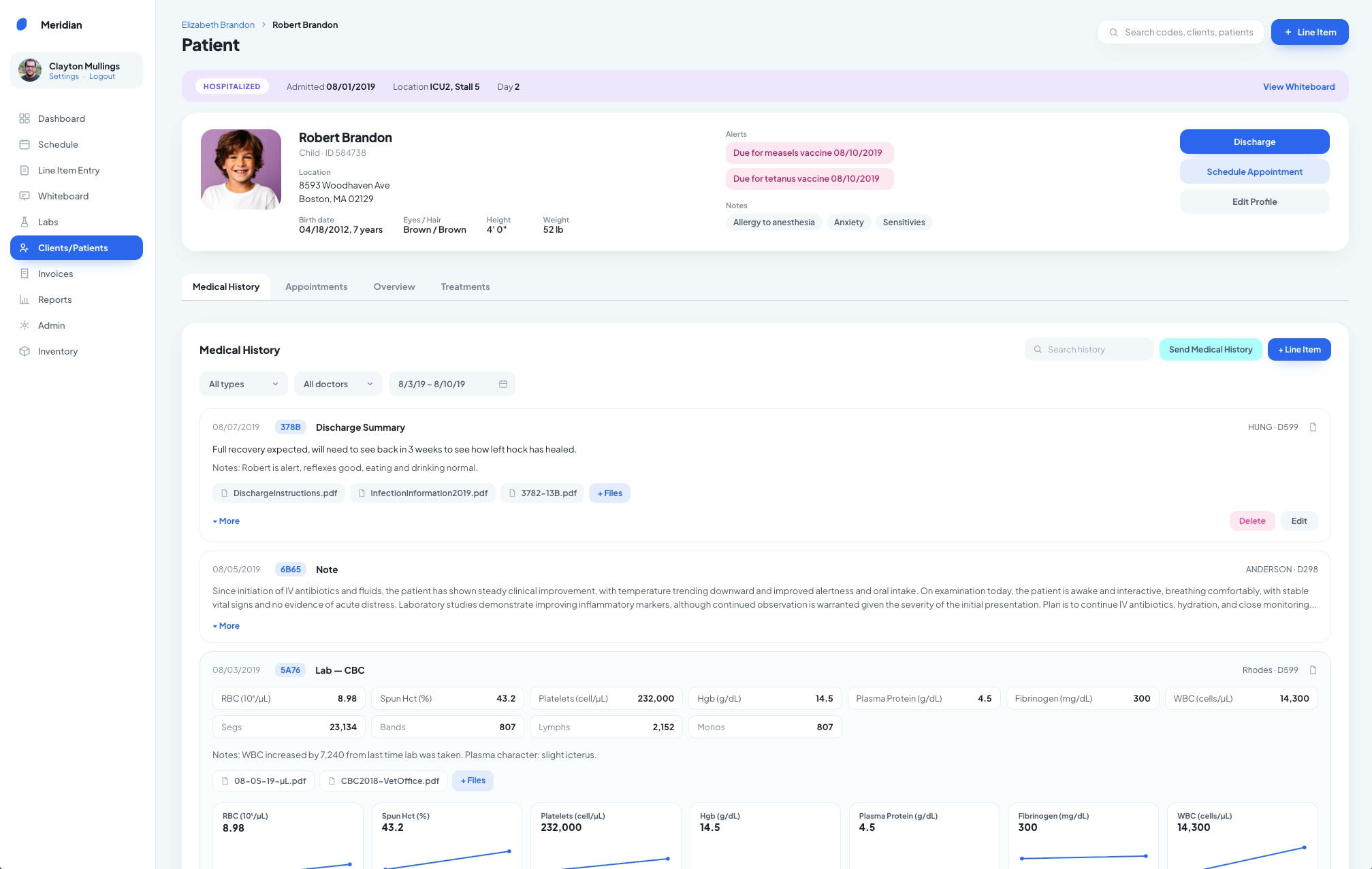
The patient profile: a patient card with alerts and notes above the Medical History tab, with a discharge summary and its attached files.
  1. Problem

    A multi-clinic client's off-the-shelf software kept getting in their staff's way, scattering work across spreadsheets, messages and workarounds.

  2. What I did

    On-site field research, then workflows, visual design and UI for a custom clinical and business platform, owning the design direction through development.

  3. Result

    Freed up 55% of staff administrative time, allowing the practice to see twice as many patients without scaling the team.

What kind of project was this?

This custom clinical operations platform was made for a client of Frogslayer’s who owned multiple clinics. The client’s existing “box” software repeatedly got in the way of its staff and resulted in lost recurring revenue multiple times through software issues.

This custom application was very technical, and ultimately connected clinical documentation, patient records, invoicing, financials, communications, reporting, inventory, and both field and in-clinic workflows in one system. This was one of the projects that made me fall in love with software design. It showed me how deeply understanding someone's real-world complicated workflow could turn software into something genuinely useful.

*This case study has been anonymized to respect project confidentiality. Product names, identifying details, terminology, and the UI have been modified. The design challenges, process, and my contributions remain representative of the work.

Team Info / Structure

I joined the project as a UX/UI Designer, working closely hand in hand with our Lead Designer Amy Hamm of Amy Hamm Design from immersive field research through sketches, wireframes, visual design, client validation, and development. Later on after the initial engagement, I had more considerable ownership over this product. This software was developed and managed by Frogslayer.

Through the time that I worked on this project, we had about 3 developers and 2 designers over a 1.5 year period. I worked closely with our development team and project manager from concept through delivery, and met regularly with client stakeholders to present work, gather feedback, and iterate on designs as the product evolved.

Achievements

Administrative time

55%

Freed up 55% of staff administrative time

Patients seen

2×

Allowing the practice to see twice as many patients without scaling the team

THE TASK AT HAND

Their software technically “worked”. Their workflows didn't.

The organization had tried several existing software products, but none fit the specialized way its teams actually operated.

Instead of making work easier, the existing systems often introduced more steps, fragmented information across places, and required staff to create workarounds.

During our intensive field research, we saw employees moving between the core application, spreadsheets, messaging tools, email, texting and other systems. Communication could become “hit or miss,” and information was sometimes lost between channels. The existing application's structure sometimes generated records in ways that didn't correspond cleanly to how the work actually happened, causing confusion around where information belonged.

Clinical accuracy, operational efficiency and financial performance were deeply connected to their software working in the manner that they worked in the real world.

Our challenge became clear: We needed to understand how the organization, clinicians, doctors and staff actually worked and build the software around it.

RESEARCH AND DISCOVERY

Watching the work happen on the ground

Early in the project, I traveled out of state with a small research team to spend time inside the organization. I learned the user workflows by watching them happen on the ground.

We shadowed people across roles as they worked by observing the software they used, the paper and spreadsheets around it, the conversations happening outside the software, and the workarounds that had become part of everyday operations.

Instead of asking users what features they wanted, we could watch:

The research revealed an environment with a high degree of multitasking. Staff regularly left one activity to respond to something more urgent, which made continuity important. One clinician specifically described losing an entire discharge document after stepping away before saving it.

Another recurring problem was simply too much information living in too many places. Efficiency wasn't a nice-to-have, but was one of the core design requirements.

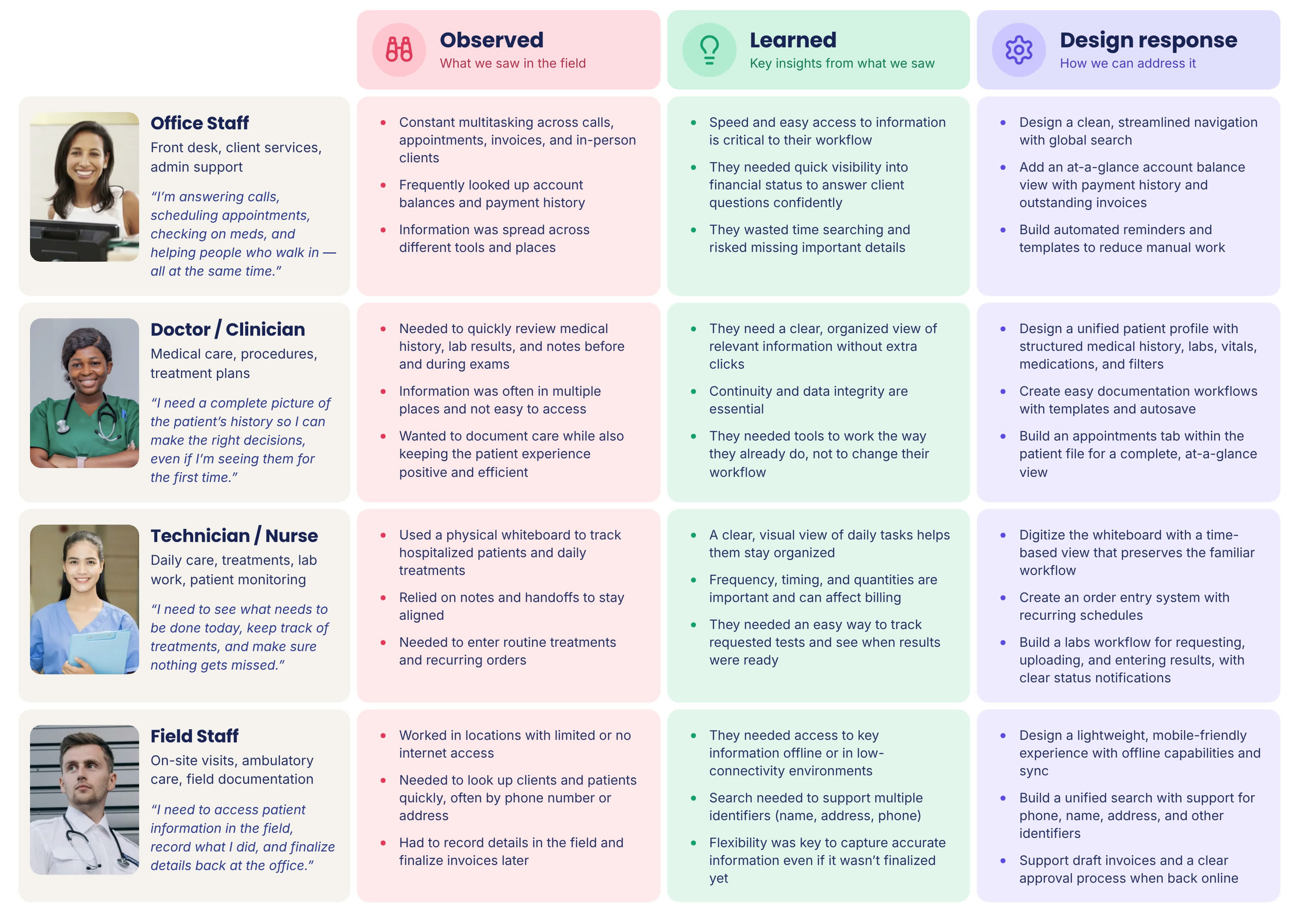
Field research by role: what we observed, what we learned and the design response for office staff, doctors and clinicians, technicians and nurses, and field staff.

What We Learned

  1. Users needed complex workflows

    The staff worked quickly and repetitively. Splitting related actions into a sequence of traditional clinical clean, simple screens would have actually made them work slower. The question at the forefront of my mind was:

    “What information does this person need at this moment to finish the job without leaving the workflow?”

  2. Clinical work and business operations couldn’t be designed separately

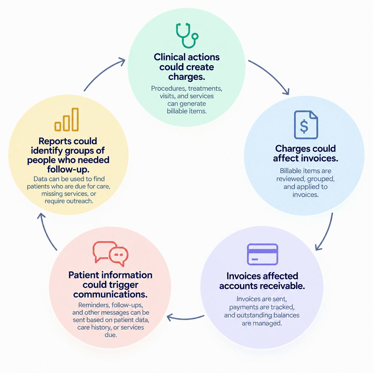
    The product behaved more like an ecosystem than a collection of features. Related information needed to work together without becoming the same thing.

A cycle: clinical actions could create charges, charges could affect invoices, invoices affected accounts receivable, patient information could trigger communications, and reports could identify groups of people who needed follow-up.
  1. Familiar workflows were sometimes worth preserving

    Many processes in fact did not need reinventing, they just needed a fluid place in the software.

    Some workflows already worked well for them, but were not a part of their current software. The challenge was to digitize them without destroying the mental model that made them useful (that became particularly important in the organization's operational whiteboard experience.)

THE SOLUTION

Turning Research Into the Product

The software grew into a large interconnected system, but three parts of my work with Amy Hamm best demonstrate the product thinking behind it.

Line Item Entry

This was only one screen, but it served several of their real world workflows. During research, we learned that employees didn't want to enter a charge, save it, move somewhere else, document the clinical work, save again, and then go somewhere else to record the client communication.

So we designed Line Item Entry to bring several pieces of work into one context:

  • Billing information Codes, quantities, pricing, discounts and practitioner attribution.
  • Clinical documentation Notes that belonged in the patient's medical record.
  • Client communication A record of what was communicated, with options to send information directly.
  • Files and supporting material Attachments and documentation associated with the work.
  • Approval workflows Individual and bulk actions for reviewing charges.
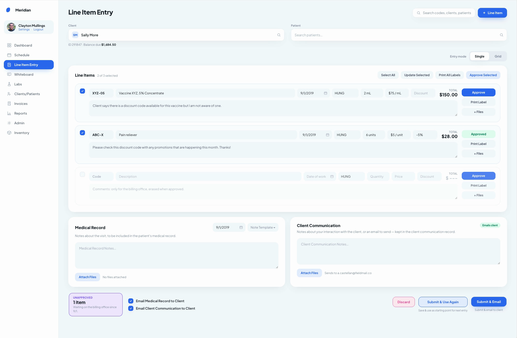
Line Item Entry: a charge with its codes, quantity, price and practitioner, clinical notes for the medical record, a client communication record and attached files.

Making Complex Clinical Information Usable

The goal was to give people the detail they needed without making them hunt for it. I worked extensively on patient information and clinical history.

The application needed to support many different kinds of records: discharge summaries, general notes, procedures, vitals, labs, medications, diagnostic information, appointments and attached files.

Research and client feedback led us to learn that different users also needed different slices of that history. Users needed to filter information by things like date and record category, then generate only the information relevant to the situation.

I designed workflows that allowed users to select the information they needed and then:

  • Email it
  • Download it
  • Print it

They could also select records across more than one patient when necessary.

The patient profile's Medical History tab, filtered by type, doctor and date, with a discharge summary and its attached files.

This was another place where we resisted oversimplifying. A clinician looking at a longitudinal history may genuinely need a large amount of information. I worked to make this information structured, filterable and items quickly understandable at a glance.

Connecting Clinical Work to the Business

The software had to understand both and the organization's financial workflows were complex.

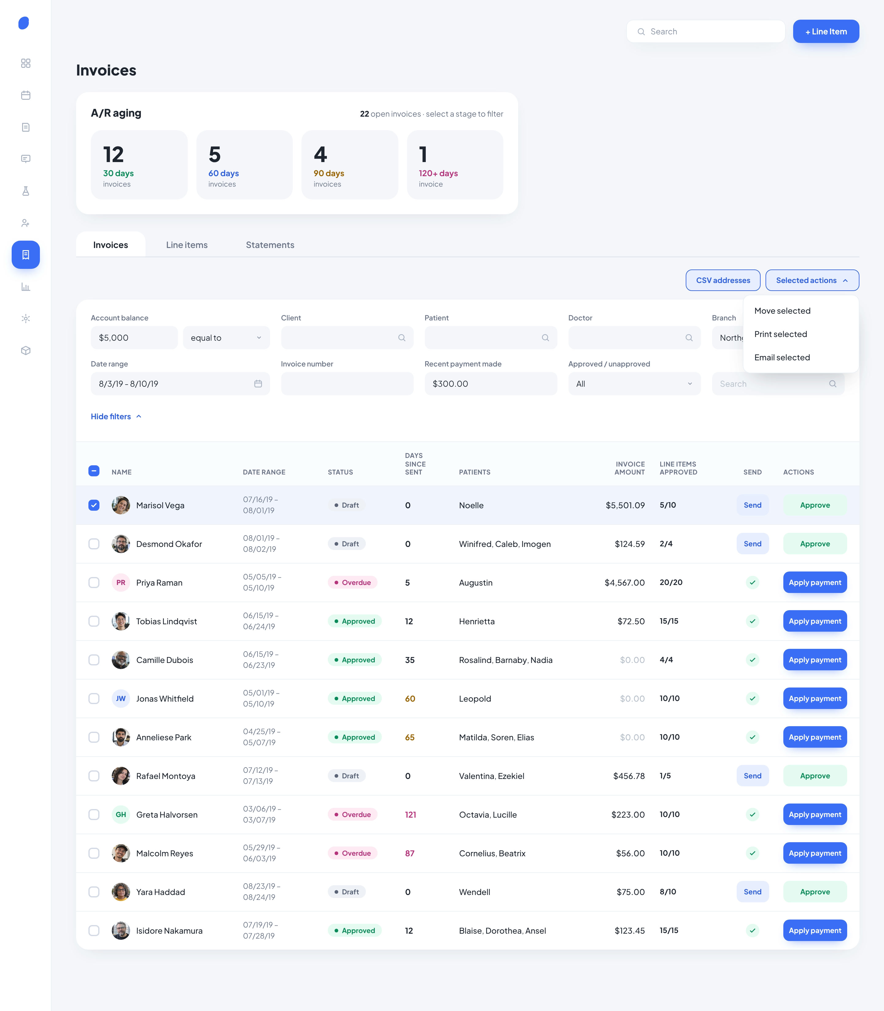
We worked on line items, invoicing, accounts receivable, reporting and financial views, where users needed to understand not only what had been billed but what had been paid, who performed the work, how old a balance was, whether an invoice had been approved, and where revenue originated.

Early requirements included individual and bulk line-item approval, discounts, statements, payments, account reconciliation, aging balances and reporting across practitioner and business categories.

(During our field research, business staff were having to carefully inspect complex cases that had been jumbled in their prior software they used, to ensure that clinical work had actually translated into the correct charges, wasting a lot of time.)

We also worked on a substantial reporting area spanning financial, procedural, sales, inventory, marketing and other business information.

The data from those reports could then feed into another powerful part of the application: communications.

Users could identify particular groups through reporting or record criteria and communicate with them directly. For example, sending reminders to people whose records indicated that a particular service was due, or filtering for a specific account balance and being able to quickly email them (note: having this done automatically was out of scope for this project)

That connection between data → segmentation → communication was particularly important to the client.

Invoices: an A/R aging summary by 30, 60, 90 and 120+ days, filters, and a list of invoices with status, days since sent, amounts, approvals and send or apply payment actions.

Preserving Familiar Mental Models - Digitizing the operational whiteboard

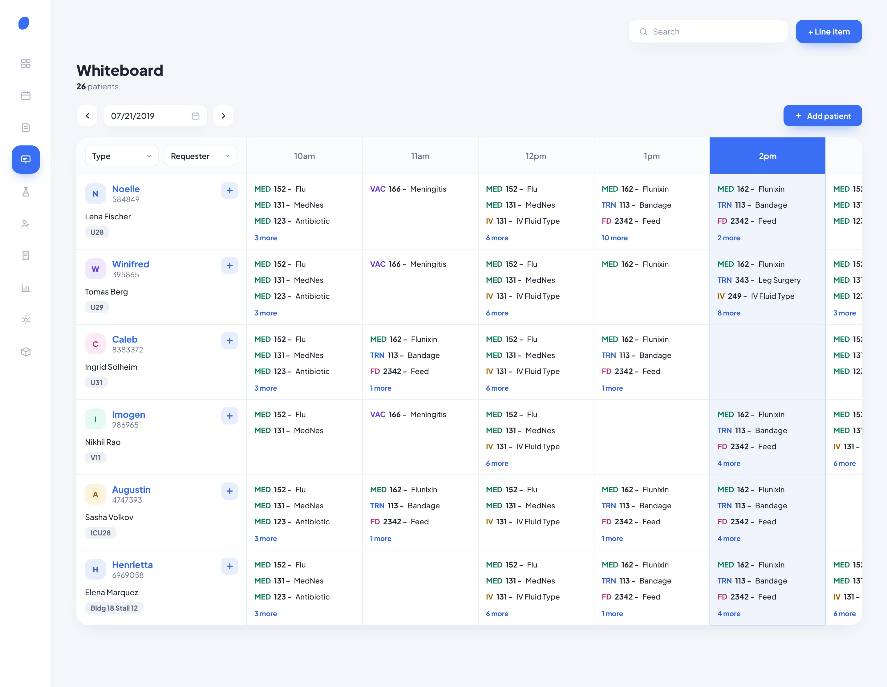
The organization already relied on a familiar whiteboard-style system to understand what was happening with in-clinic patients over time.

Rather than reinventing that concept, the digital product preserved the underlying mental model:

  • Patients vertically
  • Time horizontally
  • Care activity mapped across the day

Underneath that seemingly straightforward grid was significant complexity around recurring treatments, quantities, orders, completion states and the financial consequences of what was recorded.

The digital whiteboard: patients down the side, the day's hours across the top, and each treatment, order and check placed in its time slot.

Communications

Communication itself was another recurring source of fragmentation. Staff were already using different channels depending on urgency, and our ground research saw that messages could disappear/slip between those tools.

One information-architecture question was where those communications belonged...

Research showed that a conversation could relate to more than one patient, which made storing every client interaction on an individual patient record misleading. The team instead separated general client communication from patient-specific clinical documentation.

Amy and I designed the communications experience to support:

  • Email within the application
  • Historical communication records
  • Attachments
  • Templates and reminders
  • Filtering
  • Client-specific context

Feedback continued even after the early designs. Later on I worked directly with the client and developer on refinements such as adding mass tagging, communication tracking and reporting behavior.

DESIGNING THROUGH DEVELOPMENT

Owning the design direction through the build

After establishing the core workflows with Amy, I created the visual style directions presented to the client. Once a direction was selected, I applied it across the application's increasingly large set of workflows and states.

Once the major product direction was established, my role shifted. I met regularly with the client to refine requirements and worked directly with the development team as the application was being built.

With a development team of roughly 3 engineers, the client understood that the product would evolve over a longer period rather than being built by a large implementation organization (that made prioritization and detailed design decisions especially important).

By this stage of the project, I had considerable ownership over the established design direction and regularly resolved UI/UX questions with both the client and developers.

OUTCOME AND LEARNINGS

What I Took From the Project

By launch, the product had grown into a broad clinical and business platform spanning areas such as:

And the product continued to evolve after its initial release as the client identified additional opportunities.

This project came relatively early in my career, and I came out of it with a deeper understanding about how to design complicated workflows into a way that felt natural.

Spending time alongside users showed me that sometimes the best way to understand a workflow isn't always to ask someone to describe it but instead watching someone during their workflow... where they hesitate, what they write on paper, who they interrupt, what they leave the software to accomplish, and what happens when the day doesn't go according to plan. There is often times a lot missed with just a user interview, but watching someone at their actual workflow tells a different story of problems encountered and areas for improvements.

The technical complexity also pushed me tremendously. Clinical documentation, financials, invoicing, communications, inventory, field work and in-clinic activity weren't isolated modules. They affected one another. A seemingly small product decision could have downstream implications for the record, the client's bill, the business office or another employee's workflow.

Most importantly, I saw how software could genuinely make someone's work better, which ultimately resulted in a better patient experience too!

The client cared deeply about the people they served and wanted technology that supported that standard of care rather than slowing the team down.

Next Project EOS One - The Dashboard