B2B Collaboration Platform (Confidential)

Shipped

2019-2021UI/UX DESIGNER, LEAD DESIGNER PART OF 2021

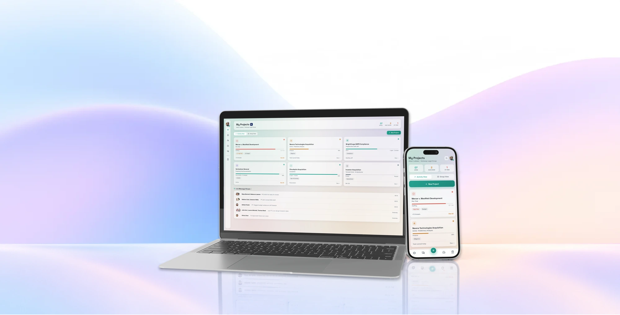
The Signal platform's My Projects page on a laptop and a phone, in front of soft pastel waves.
  1. Problem

    Cross-organization work was scattered across email, chat, documents and task tools, and a new platform risked becoming one more place to check.

  2. What I did

    Designed across research, product strategy, interaction design and UI for web and mobile, moving into the lead product designer role in mid-2021.

  3. Result

    A scalable web and mobile platform. The company raised $14M+ after launch, eventually $25M, and is now valued at $55–83M.

What kind of project was this?

I worked on an emerging B2B collaboration platform designed to help teams across different organizations coordinate projects, documents, tasks, conversations, and external collaborators in one place.

As a product designer, I worked across research, product strategy, interaction design, and UI for web and mobile, helping evolve an early-stage product idea into a scalable, successful web and mobile software platform.

*This case study has been anonymized and called “Signal” to respect project confidentiality. Product names, identifying details, terminology, and the UI have been modified. The design challenges, process, and my contributions remain representative of the work.

Team Info / Structure

I worked as a product designer on this project under lead designer Amy Hamm of Amy Hamm Design and alongside Frogslayer, eventually moving into the lead product designer role in mid-2021. We worked in an agile, cross-functional development environment. UX participated in sprint planning, reviewed implemented work during demos, logged issues, answered client questions, and participated in retrospectives with the development team.

We started small, but by the close of Frogslayer's time on the project, the team had grown to approximately 12+ developers across multiple squads, 3–4 project managers, 3–4 QA specialists, and 5 people across product.

Achievements

Company valuation

$55–83M

Company valued at 55-83 million now
(dealroom.co)

Funding raised

$25M

  • $14M+ post launch
  • $25M eventually
THE TASK AT HAND

Work was everywhere, and nobody wanted one more tool

Our task was to design a collaboration platform around the way teams actually work, particularly when projects involve multiple organizations, tools, and stakeholders.

Work was happening everywhere. Complex projects rarely lived inside a single application. Internal teams, external partners, and other stakeholders collaborated across email, communication platforms, document-management systems, task tools, and organizational boundaries. It was a mess for everyone involved.

Our opportunity was to bring that work together. But introducing another platform also risked creating one more place users had to remember to check.

Our challenge was to make a fragmented, complicated ecosystem of work feel simpler, without forcing people to abandon the tools they already relied on.

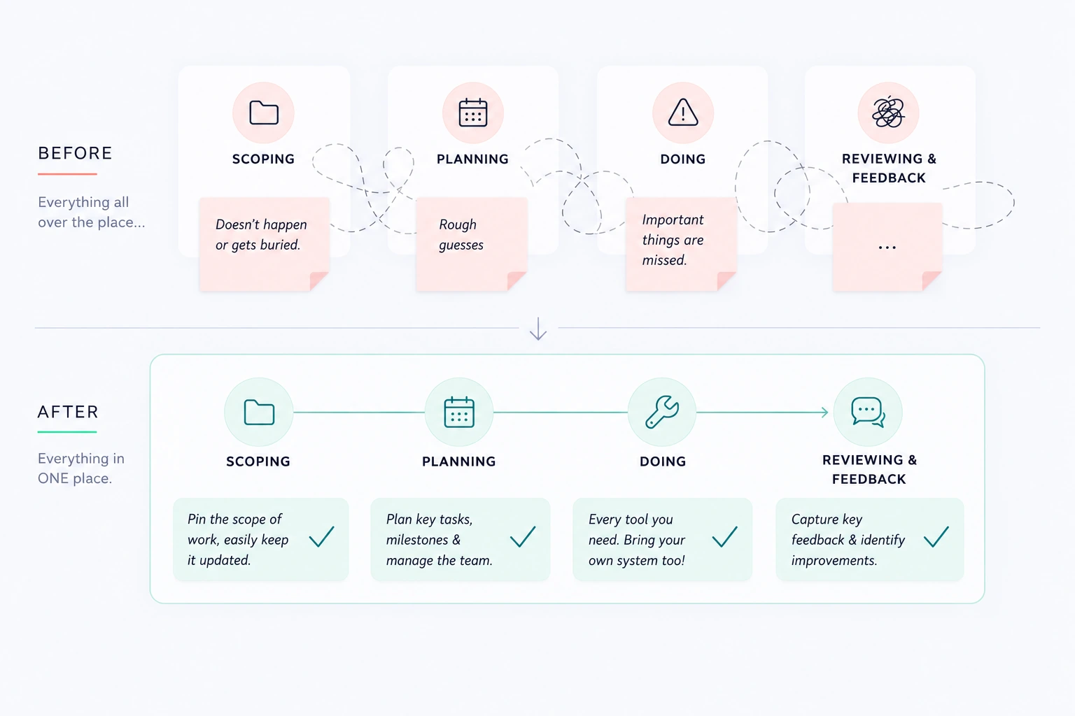
Before: scoping, planning, doing and feedback were all over the place, with work buried, rough guesses and important things missed. After: every stage in one place, from pinning the scope to capturing feedback.
RESEARCH AND DISCOVERY

Understanding where our product actually added value

I participated in research with professionals to understand how they were already managing projects, where existing workflows broke down, and where our platform could provide something meaningfully different.

Themes that appeared

  1. Users didn’t need “another” place to work and add to their mental load

    Between internal tools and outside softwares, professionals had too digital interfaces that they were using. Instead of asking users to abandon establish workflows, we needed to bring them in.

  2. The opportunity was in connecting the pieces

    We began asking more systemic questions: Could a document requiring review become a task? Could a conversation become an actionable task? Could documents be connected directly to the work they supported?

    We weren’t interested in building a better task manager, but instead we asked, “How can tasks, documents, conversations, people, and deadlines work together around a project?”

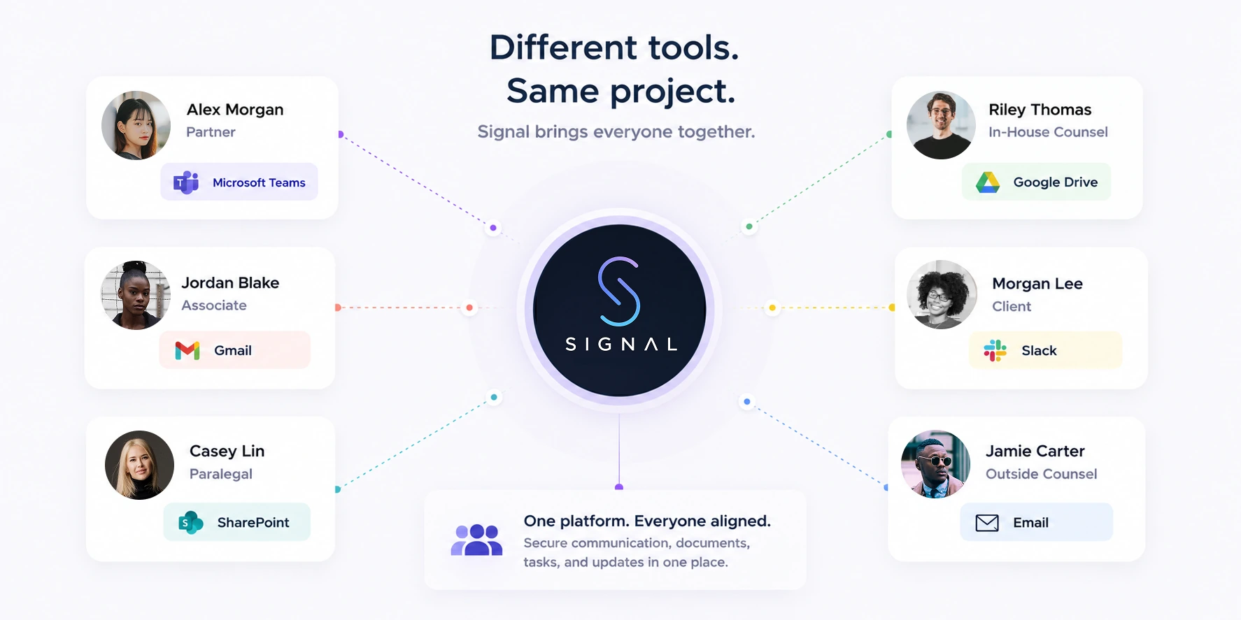
Different tools, same project: a partner, associate, paralegal, client, in-house counsel and outside counsel on Teams, Gmail, SharePoint, Google Drive, Slack and email, all connected through Signal.
HOW I SHAPED THE PRODUCT

Purposeful functionality

As the platform grew, my work (along with my product colleagues) increasingly focused on how features related to one another and how the experience would scale as more functionality was introduced. I worked to make sure that complex information felt easier to navigate.

We explored information hierarchy, cognitive load, primary versus secondary navigation, and how to organize a growing set of tools without overwhelming users.

Instead of optimizing only for what existed at the time, I had to consider: What happens when this product has twice as much functionality?

That systems thinking influenced navigation, filtering, task organization, document workflows, and progressive disclosure throughout the product. I also attended every demos, sprint review, sprint planning and backlog meetings, as well as met with the clients often to review mockups and discuss direction. At one point I was even making small UI edits directly in code, pushing changes to our main branch once reviewed.

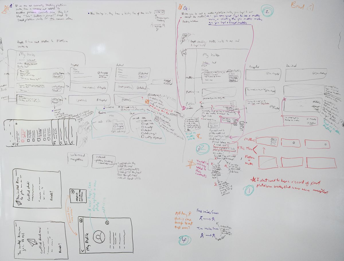
Whiteboard sketches of invitation flows, navigation states and mobile to-do screens.
Working through invitation edge cases, navigation and states as well as mobile navigation of to-dos and invites. (Whiteboarding intentionally left small to protect project details.)

Designing beyond the happy path

A significant amount of complexity and edge cases lived outside the app’s primary workflows, such as,

I designed across permissions, confirmations, duplicate content, errors, empty states, destructive actions, and other edge cases across web, mobile, and integrations.

For example, when someone created an item through Microsoft Teams, I advocated for explicit confirmation so users weren't left wondering whether the action had succeeded. These edge cases needed to be handled carefully because of the nature of privacy and security, yet this was juxtaposed with items being integrated with everything. This project quickly became very technically difficult.

THE SOLUTION

Early work on the product

Rather than show every feature I worked on, these three areas demonstrate the breadth and complexity behind the final product.

Document Workflows

Our goal was to make complex document management feel familiar/easy. Documents played a central role in the platform, and managing them across multiple users, organizations, and connected systems introduced some of the product's most complicated interaction problems.

Users brought strong expectations from the document-management tools they already relied on. Research showed that they expected familiar behaviors from established cloud document systems.

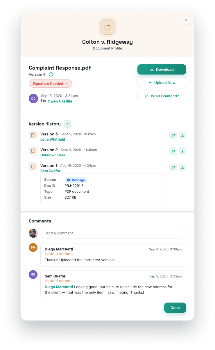
I worked across document profiles, previews, metadata, version history, uploads, connected storage, duplicate files, permissions, and editing behavior.

And as a young designer working on this project, mobile introduced a different challenge.

Rather than simply shrinking the desktop experience, we considered what users were actually likely to accomplish from a phone. The expectation was more often to quickly view or skim a document than perform heavy document review or drafting.

I learned on this project with mobile design that responsive design shouldn’t always be about feature parity, but rather the experience should always respond to the context first.
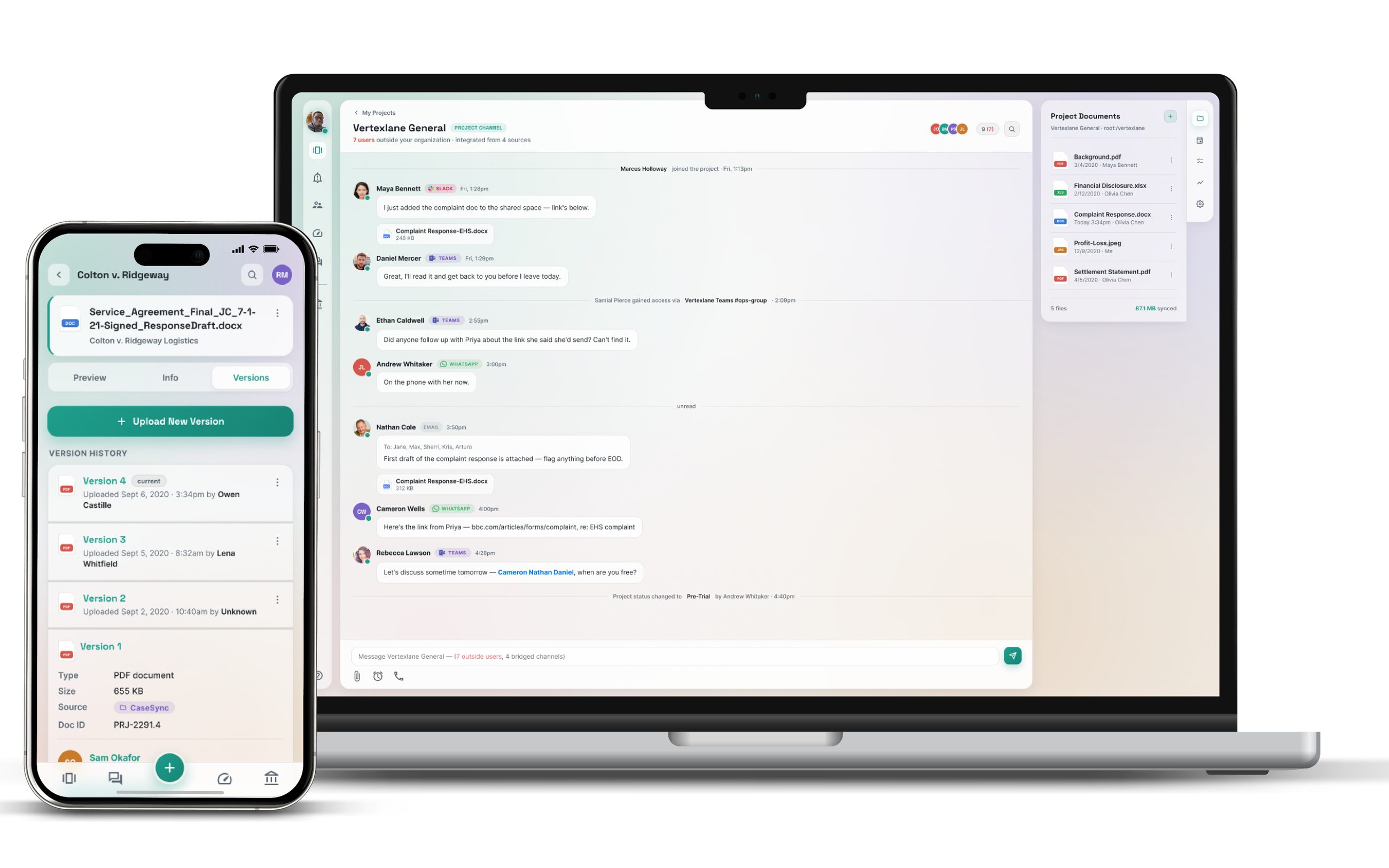
The main document page on a laptop, with a document's version history on a phone.
Main document page
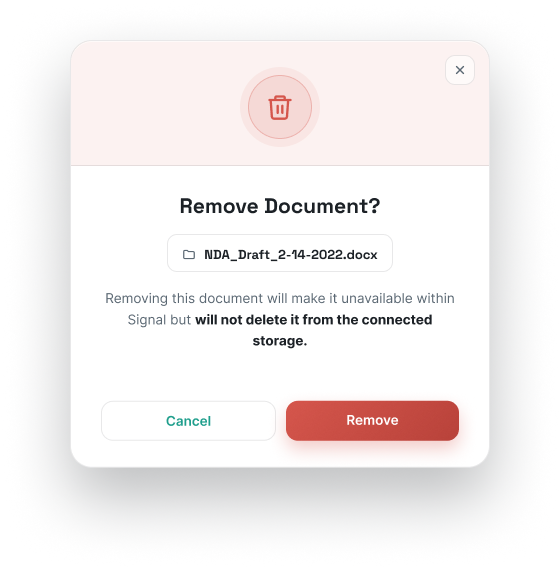
Remove Document? confirmation explaining the file stays in the connected storage. Document profile with version history, metadata and comments.
Select document management popups

Integration Challenges

Instead of requiring users to constantly switch between applications, we researched and explored how relevant project information and actions could surface directly inside our integrations (because it would be annoying to be double notified everywhere when an action is done).

Interviews that my colleagues did helped us identify what might be valuable in those contexts, including tasks, milestones, project status, scope, and conversations.

The design challenge wasn't “How much of our product can we push through into these integrations?” but instead “What does a lawyer actually need from our product while they're already working in slack/teams/etc?”

The integration also required thinking through authentication, permissions, account relationships, mobile behavior, notifications, and how actions moved between two systems.

I came away with a stronger philosophy around integrations after this. Specifically, the best integration design isn't the one that exposes the most functionality, but the one that reduces the amount of work users are having to manage.

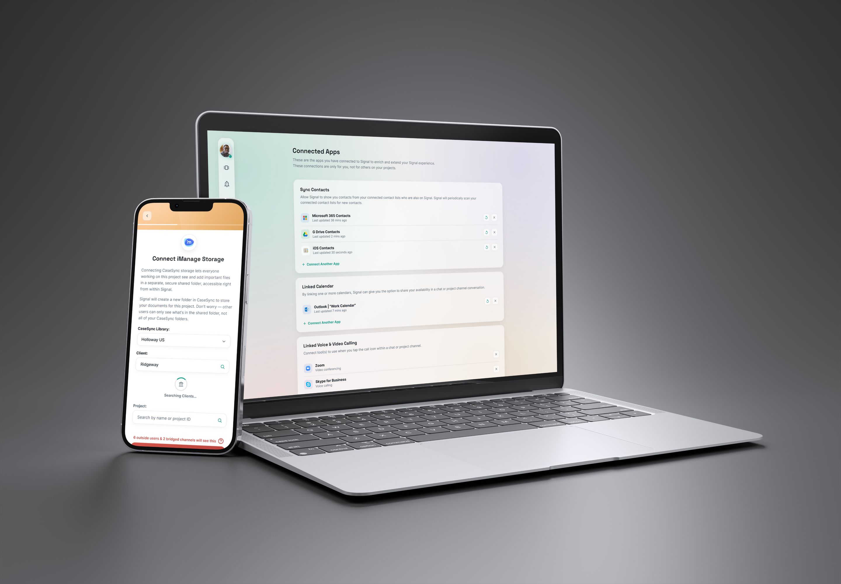
Connecting iManage storage on a phone, and the Connected Apps page on a laptop.
Adding an integration from mobile and chat feature bridging all messaging integrations

Cross-Organization Collaboration

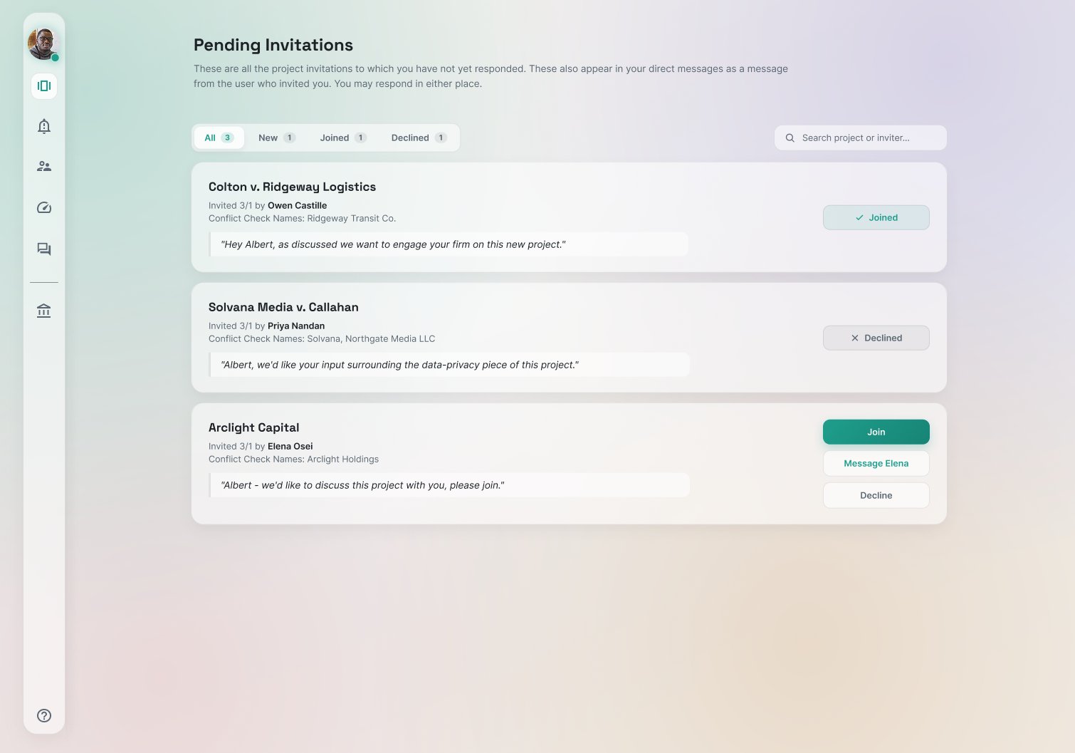
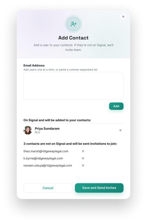
Complex projects often involve internal teams, external partners, stakeholders, and other participants working across organizational boundaries. That meant invitations, permissions, identity, and visibility were fundamental to how the platform worked.

Even something seemingly simple like an invitation raised larger UX questions:

  • How prominent should an invitation be?
  • What happens when someone accepts or declines it?
  • What can an outside participant access?
  • How do we communicate organizational boundaries without making collaboration feel cumbersome?

I worked through those scenarios across the broader invitation and participant-management experience.

This was a recurring theme throughout the project: simple looking interactions often sat on top of complicated rules.

Pending Invitations page with joined, declined and new project invites. Add Contact popup inviting people who aren't on Signal yet.
Pending Invites page and adding a contact

Designing with constraints

As we approached a major product release, scope tightened and prioritization became increasingly important. Larger concepts often had to be broken into smaller increments that could deliver meaningful value without compromising the longer-term direction. Engineering constraints shaped the experience as well. For technically complex areas (particularly document editing and third-party integrations) I worked alongside development as we evaluated implementation approaches and adjusted designs around what was feasible.

OUTCOME AND LEARNINGS

What I Took From the Project

This project changed how I thought about complex product design. For being on this project early in my career, it reinforced that some of the most important design decisions happen between dev conversations, UX research and drawing/talking through problems that are complex in nature. It was really important to the success of the project to be a close knit team with the developers. I also wish that I personally would have done more user research on this project. One large design change could have been avoided if we had advocated for testing our designs on users early and often (the right sidebar of our web app ended up being too small for users to see tasks, documents etc once they were filled with actual project work 🤦‍♀️. Learned an important mockup lesson as well!).

The project gave me experience balancing user needs, business priorities, technical constraints, and an evolving product strategy inside a genuinely complex technology product.

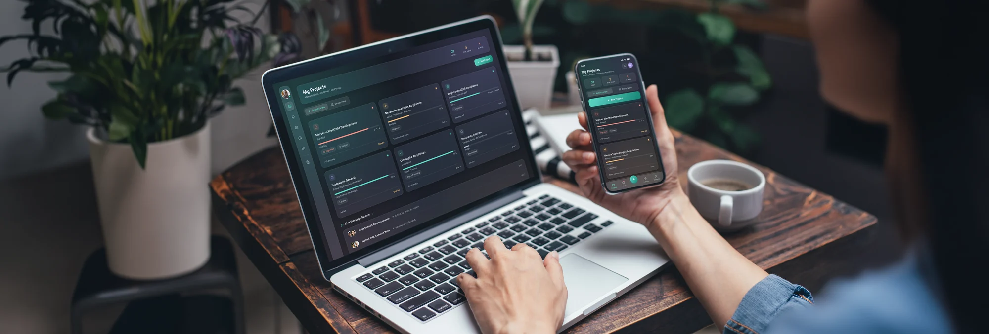
Signal's My Projects page in dark mode on a laptop and a phone, at a wooden desk.
Next Project Clinical Operations Platform